People like a lot of definitives when it comes to advice. What is the MOST important thing I should do? What are the TOP mistakes not to make? What is THE best strategy on marketing my app? So I tried to sit down and think what is the ONE thing I can tell people about their apps…but I think that would be oversimplifying your businesses. And as many of you know, there are many pieces of the app puzzle. Instead I’ve broke it down to the BIGGEST mistakes to avoid during the first stage of your app building.
It’s incredible how many students have come back to me after breaking past a plateau or reaching another milestone and told me this is the one lesson that saved their business. Of course their hustle and badass determination was a huge part, but this lesson alone has made or break an app’s success.
Stage 1: Market Research
Think of market research as the entire foundation of your app business. Whoa, kind of heavy to think about? Everything is resting on one idea? Lucky for you, NO.
Market research is much more than coming up with a winning idea. It’s about research and execution. You always hear people claiming they have a “million dollar app idea,” but most won’t hold their weight. That’s not because they’re not good ideas, or even great ideas but usually they are a) poorly researched and/or b) poorly executed.
So where exactly do people go wrong along the way?
How could my app be poorly researched?
This is where you need to get down in the trenches of the App Store: the top free and paid charts.
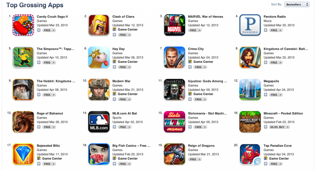
One of the most common mistakes appreneurs make is focusing on the wrong apps. For example, the Top Grossing charts has a lot of big names, brands, and big advertising budgets. If you’re trying to base your logic off “emulate Top Grossing = make big money,” you’re not really looking at the App Store correctly because you should be asking yourself, “What are the underlying reasons this app is successful?”
The answer is never just, “a lot of downloads.” You have to dig deeper. Look at the top 200 apps on the free charts and write down all the trends you’re seeing and dissect them piece by piece. Why is this successful right now?
Use resources like topappcharts.com, appannie.com, and 148apps.biz see app’s histories and current market stats.
Another mistake is not spending enough time on the App Store at all. You’ve had an idea for awhile now, and you can’t get it out of your head. You look at the App Store, and in your mind you justify that the app would be popular in this marketplace, but really you might be molding the marketplace around the app, rather than vice versa.
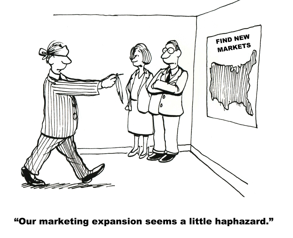
You can’t develop with blinders on. How did you come up with this idea? Was it from researching the market for weeks/months? Or is it something you and your buddies have always wanted to use? There’s a big difference.
Your idea could be really great, and maybe eventually even fit the marketplace, but if the market isn’t presently interested, it won’t stick and you could be out thousands of dollars in development costs. That’s not to say these “hail mary” app ideas don’t ever become successes, but it’s extremely risky and very rarely works out.
You also have to keep in mind that many successful, seemingly innovative apps on the App Store are actually not “hail mary” concepts. Instagram? There had been photo filter apps of the same nature way before Instagram became popular. Their edge was emphasizing the social aspect and creating a killer user experience with a simple layout. WhatsApp? Messaging apps were not only popular but common! It was their execution and dedication to the users (listening to feedback, no ads) that kept people hooked.
And this research applies to everyone’s strategies, whether you’re skinning apps, choosing just a couple ideas, or developing for businesses. You need to figure out what’s being downloaded and why.
How could my app be poorly executed?
So you did your research, and you found an idea you feel is really solid and well-researched. This is where many people accidentally go down the wrong path without realizing it. The idea may be there, but the execution strayed from the research.
You need well-researched designs and functionality just as much as a well-researched idea.
If you’ve been doing your research in the App Store correctly, you’ll notice the quality of UI (user interface – or what the user sees) has increased a lot over the last couple years. It’s all about looking sleek, but keeping it simple and easy for the user. Aside from that common variable of current apps, you need to look at the common, popular features of the trends you’re emulating. The execution needs to be consistent with the current market’s standards of how this app should feel, look, play, function, etc. And this especially goes for your icon and screenshots (your best marketing tools) as well! You cannot skimp here.
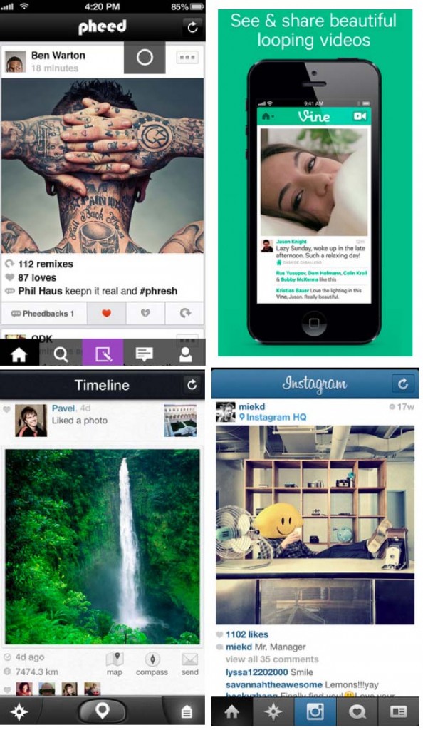
Take a look at social networking apps. Note the similar features and design style. This demographic of app users have come to expect a certain type of UI for the apps they know and love. Straying from this proven design too much will result in minimal downloads. This is what users are looking for, which is proven again and again by the layout of the top networking apps.

Just like researching an app’s idea, you need to research marketplace designs. Of course, there’s always room for improvement, but that’s the point! Look at an app’s features/design and think, “What does this UI/UX do well, and where does it over complicate or lack?” Keep what works, change what doesn’t. That is where you find the money!
I want to hear from you! We’ve all had failed apps (you wouldn’t be an appreneur if you didn’t!):

