Help your apps get featured with these design tips and resources…
Design is EVERYTHING to app development and success.
But the design process doesn’t come naturally, people usually need a fair amount of guidance in this area. Designing an app is like designing a house. Most of us aren’t architects and have no idea where to start. But with a little practice, you’ll be designing winning apps in no time!
Lets start with some examples of poor app design (seriously what’s wrong with these people), and design tips that will help your apps get featured.
Example of Poor App Design – What the?
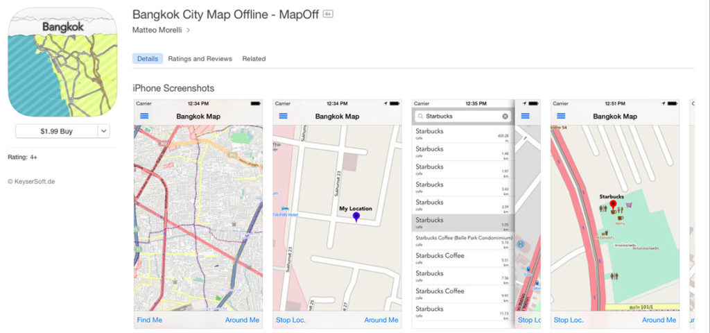
Yuck!
I travel A LOT! Instead of using my cellular plan abroad and getting hit with major roaming fees, I download apps that contain city maps I can use while offline. The app above did a great job describing it’s functionality with its title, but the design is…tragic.
Create a welcoming experience
This app looks like something you’d find on a city planner or engineer’s desk. Do I need a masters degree to understand what’s going on here? I just want to find an internet cafe!!
Make your app easy on the eyes so the user doesn’t get a headache while using it. Less is more in most cases.
Add emotion
Keep the user engaged. Examples of adding emotion are:
- Language
- Rewarding users with a gift
- Solving a problem
My favorite strategy to engage emotion, is by adding an element of surprise. Get creative!
Virality
Does this app look like Apple would put it in the featured section?
No…
Design your app so it looks and feels like something Apple would promote. Your app’s design will dictate if your app looks quality, or like junk. A majority of the apps I get asked to review look like a 3rd grader did the design. Hire quality designers, create an addictive experience, and shoot for something that looks and feels like it belongs in the featured section of the App Store.
If every app in the Editor’s Choice section looks better than yours…try again.
Example of Great App Design – Hopper
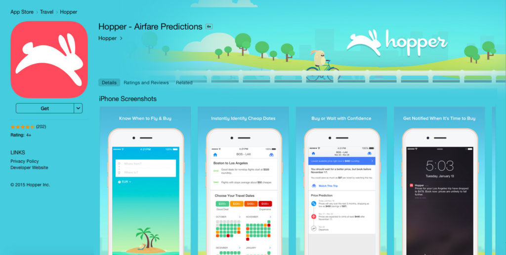
Hopper is an app I use all the time to locate the best deals on flights quickly and easily. When you think about booking a flight, a lot of details come to mind – locations, dates, times, price… Ugh! It can be painful to search for the perfect flight.
Hopper does a great job of delivering the information you’re looking for visually.
A couple great things the developers did right with Hopper…
Color & Text
Hopper uses color so users can quickly locate prices that are in their price range, and weed through the ones that are too expensive. Color plays a detrimental role to the user experience and the app’s design.
In most travel apps, there’s an overwhelming amount of text, but the user is only looking for a few key components. Don’t bother users with lines and lines of text – who has time to read all that? Hopper has minimal text so users can locate the information they’re looking for easily and painlessly.
Flow
With Hopper there’s only two directions you can go – forwards, and backwards. The app is linear with the end goal of finding the cheapest flight.
Hopper guides the user through the app. To put it simply, the app tells you where to go. Take the user to your desired end goal. This could be an in-app purchase, unlocking a new level, or sharing with friends.
Define your app’s end goal and design the app backwards from there.
Intuitiveness
Make your app easy to use – don’t add too many elements (remember, less is more). Hopper immediately shows the user that it’s easy to use with their icon and screenshots. The icon is a simple image that brands the app. The screenshots act as an onboarding sequence to show the user the purpose of the app, and teach them how to use it.
The most important design elements are:
- App icon
- App screenshots
- App video
These are the components that are going to drive people to download your app.
Now for the fun stuff! Below are some resources I’ve used to hit the top charts. They will help you master the Art Of App Design too.
Tapworthy
 I HIGHLY recommend “Tapworthy” by Josh Clark.
This book is awesome. Josh breaks down TONS of examples of beautiful design and apps with great UX. He goes into a lot of detail about what makes them work, and what you should avoid.
For instance, he talks about improving app ergonomics (making the layout comfortable for your thumb), what makes a great launch screen, the best gestures to utilize for specific actions, and a whole lot more.
It’s about $25 on Amazon and absolutely worth picking up a copy. And to be clear: I don’t know Josh, I just dug his book 🙂
The Art Of Game Design
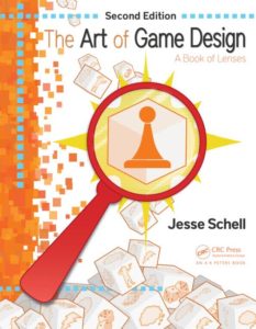 If you’re developing games, “The Art Of Game Design” by Jesse Schell is your meal ticket.
It doesn’t matter if you’re new to games, or looking to improve an existing one – this book is a necessity!
Jesse illustrates 100 considerations (lenses) that need to be addressed in order to create a game and master the fundamentals of game design.
Every successful game developer I know started with this book.
You’ve probably heard of my book App Empire: Make Money, Have A Life, And Let Technology Work For You. Chances are you’re even visiting this site because you read the book and got a lot of value out of it.
But books aren’t the only place to master app design…
Design is really about solving problems
The best way to ensure your app not only looks great, but functions properly too, is by designing it yourself. I always start the design process by drawing out a wireframe. I’ll use a cocktail napkin, dry erase board, piece of paper…whatever is near me to get the idea on paper. But if you want to take it a step further and make sure your developer knows EXACTLY what you want, create a mockup.
A mockup is a model (or prototype) that allows developers to tap, swipe, and browse your app idea firsthand
Creating mockups is easy too. I use tools like UXPin to quickly make mockups my developers can use to create a Minimal Viable Product (MVP).
The killer part about mockup tools like UXPIN, is you can create interactions. Interactions allow someone to push buttons, purchase moch-goods, use search bars, and even trigger animations (it’s pretty insane how detailed you can get).
Test the User Experience before the app has even been created. Sometimes what’s in our head doesn’t work out in reality.
Another benefit mockups offer is testing navigation. It’s easy to forget a back or menu button on a wireframe, but with a mockup you’ll catch it right away.
Model & improve what’s already working
You already have access to all the design secrets just by using the App Store.
App Design is a sixth sense, you need practice in order to master it. All the books and tools in the world won’t help unless you are actionable. Download apps in the featured section of the App Store, and routinely see what patterns the Top Charts apps are using to capture audiences attention.
Time to get to work!

