It’s ok…I think I got this.
Is it time to give up on my app?
We’ve all asked ourselves this question before. Sometimes there is a time to move on. Whether you picked the wrong market, over-spent your budget, or lost your vision, it’s important to know when to cut your losses and move on to money-makers!
But how do you know when to “give up”?
A common mistake is to give up on an app just because it doesn’t stick right away. Ideally, your app starts bringing in revenue from launch, but other times it takes months, and you need to be willing to stick with it if you want it to pay off. Just as much as you want to analyze what’s working, you need to analyze what’s going wrong to either course-correct or learn it’s time to move on.
Here are the questions I ask myself to determine if I should move on, or if the app just needs serious improvement.
App Checklist: Can my app be saved?
Overall
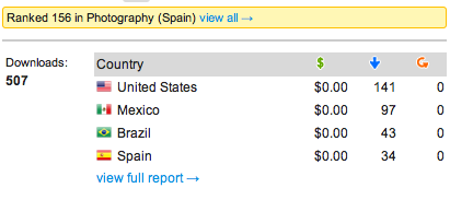
1. Has this app gone up or down in the rankings? Why? ?Are there relatively high/low downloads in certain countries? Why?
2. Is my marketing converting? In other words, are you getting traffic? From where?
3. What do reviews say? Can I fix the things people are frequently complaining about?
Note: You will always get bad reviews. Don’t let every one affect you. Take constructive criticism, and strategically think about what should change. Should you take out the $0.99 ad-free upgrade just because some users don’t want ads? Not if it’s clear people are willing to upgrade. Focus on what you can change that positively affects your outcome.
4. Do people like this app? How often do they use it?
5. How can I add more value for my users? Look at your reviews, and reviews of competing apps, that suggest constructive, actual changes. Not just “This app is too easy!” or “These ads suck!” Look for detailed information. Also look at blog reviews as they contain valuable insight.
6. Can I monetize this app better? How?
Note: Stumped for ideas? Look at the market. What are ways other apps are monetizing? Look on developer forums. Ask around for the latest data.
Icon
1. Is there a style of icon for a competing app that’s doing better? Why?
2. Can I keep my current design but try different colors?
3. ??Are users able to understand what the app is for by looking at the icon?
4. Is my icon’s style similar to proven icons in the market, or am I trying to be overly creative?
![]()
Title
1. Is my title clear??? Does my title describe the app’s functionality?
2. Does my title use strong keywords?
Note: Title rank changes. Short app titles used to place better, as did long keyword-saturated titles at one point. Right now, the best titles are 2-5 words long.
Description
1. How can I make my description less cluttered and easier to read?
2. ??How can I better explain the functionality of my app?
3. How can I make it more exciting?
4. Do I have a call to action?
Note: Descriptions don’t matter like they used to, but there are people who still look at them, so make sure it’s tailored to your demographic. Is your app funny? Badass? For kids? Convey that language in your copy.

Screenshots
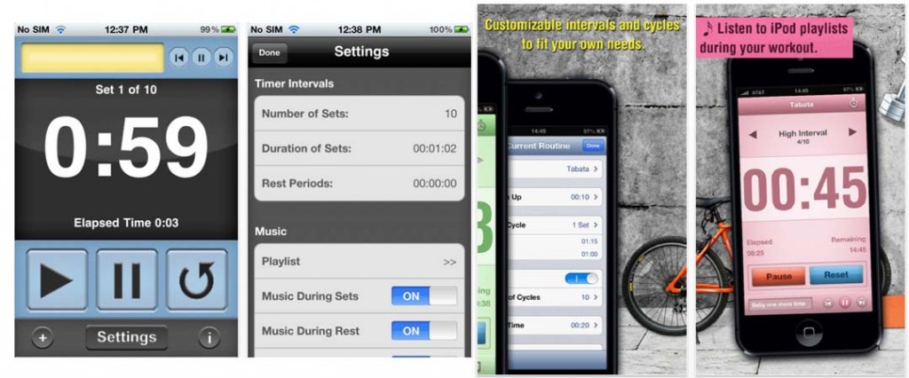
1. Can I make my screenshots more impressive visually?
2. Do they fit the theme of the icon and the rest of the app?
3. How can i make my screenshots less cluttered and easier to understand?
4. Do they have text banners that explain the functionality?
5. Can I improve the text banners to mention more and better features?

Two different apps, one with noticeably more appealing marketing.
Keywords
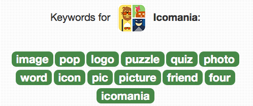
1. What words does my target demographic use to look for my app?
2. What keywords are competing apps using?
3.What other relevant keywords can I test?
4. Am I using all the space available for keywords (100 characters)?
Note: No need for spaces after commas. You get more keywords without including spaces. Ex: dog,animal,fun,funny

Categories
1. What other category could my app be in?
2. What category are the competing apps in?
3. What category is less competitive and might provide more visibility?
Have you revived an app from near-death before? How did you do it?
