— This is a guest post by Cliff Viegas, owner of Kerofrog, a mobile app development company dedicated to quality iOS apps and design. —
Which is why the User Interface (UI) and Experience (UX) are so critical.
What I mean by this is creating an experience that is pleasurable, easy and makes sense, and will have users coming back for more.
But I’m not a designer, I don’t know anything about UI or UX!?”
The good news is you don’t have to become an expert in app design, but having a base understanding of what makes good UI will make you and your team move much faster and create better apps:
3 Tips to Be a Hot Shot UI/UX Expert
1. Find the best apps in your niche and ‘model’ their interface
What you are looking for is a clean, clear and engaging user experience & interface. Browse the store to see what stands out to you, and also what’s already popular. Download these apps and have a play with them. Take notes on what parts of the Interface made sense to you, and what was difficult.
Trust your instincts. If you find yourself getting frustrated, bored or just don’t understand the app, then note that! It’s important to look at what you don’t like as well as what you do. If you’re feeling this way, chances are other customers do as well.
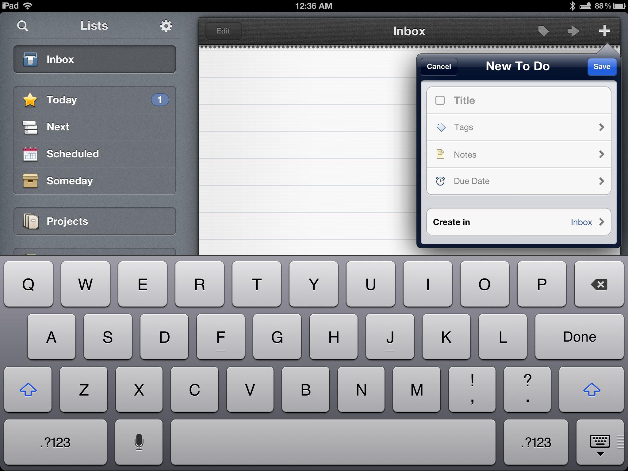
An early example for myself was my Task Management app I coded in 2010. To save me time, I looked around to see who was providing the most pleasurable experience in this niche – which at the time was ‘Things.’ And I then modeled the UI & UX on the parts of ‘Things’ that worked well!
It saved me so much time too! It was my first iPad app and ‘borrowing’ parts of the ‘Things’ UI made the process sooo much easier – and happened to get the app featured by Apple, which helped me earn a cool 30k for the month.
As you can see you don’t need to be a UI expert to be a UI expert 😉
2. Let your developers and designers know this is what you are looking for.
Give them examples of User Interfaces from these apps that you liked and you want them to be using.
For example, you might see an app that has a really cool layout for displaying and updating its information. You will want your developers to create a similar layout, style and implementation of what you are sharing with them.
This doesn’t have to, but can also include fonts, positioning, colors and shading that the other app uses. Just don’t make an exact copy! There are always improvements or personal touches you can add. Remember the goal of emulating is to improve and outdo your competition – not to copy.
To make this process even easier, grab a bunch of screenshots and draw circles and notes over the parts you like. You can either do this on your computer, or go old school and print them out, make your notes and then scan + send them to your devs.
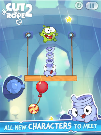
It can even just be simple things, like sharing a screenshot of a popular well designed app and telling your designer to duplicate the style used for their screenshot captions or the ‘pause + refresh’ buttons for your own game.
3. Look for trends
Yep. Trends apply even here. Think about it, users get used to ‘trends’ amongst the apps they play with every day. It makes sense to bring across these trends into your own apps.
For example, right now iOS 7 flat minimalistic style is big so you definitely want to style your apps (not so much games) around iOS 7. The great news is that your developers can re-use a lot of the standard Apple UI here to create this effect for you automatically.
Some other current trends are –
Icons
For games, a current trend is having a small frame and then having the inner elements overlap the frame to make it look like they are jumping out of the icon.
A note here is not to allow too much overlap the frame, as you can potentially lose the ‘jumping out’ effect.
For other apps, it’s much more of a clean, flat and minimalistic style that is big right now.
Main Button Positioning
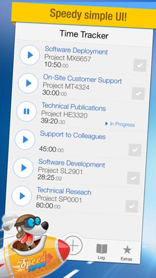
Often, your app may have a button that is used extensively, such as for a Time Tracker app where the user is most often tapping the ‘new time’ button.
In the past, this was always placed at the top right on the navigation bar. But when you think about it, where is the users thumb?
It’s at the bottom of the screen. So why put that button at the top right?
Which is why this new trend is taking off. You’ll see below where adding a new time can clearly be seen and accessed by users at the bottom of the screen.
One final piece of advice is that the user interfaces are the simplest user interfaces – so always be looking at how you can minimize the amount of options, features, buttons, and workflows that you present to users.
Now take your apps to the next level!
Cliff.
___________________________________________________
Kerofrog is a small family of App craftsmen that have been making apps for both ourselves and clients since the App Store first opened in 2008. Our passion is in our craftsmanship and consistently looking into how we can take our Code Construction, UI, UX and Design to the next level.
___________________________________________________
What’s your biggest UX or UI challenge? Do you do your own design or do you outsource?

